
Get A Sneak Peek at my book “Your To-Die-For Life”!
Get a FREE sneak peek! Learn how to use Mortality Awareness as a wake up call to live more boldly.

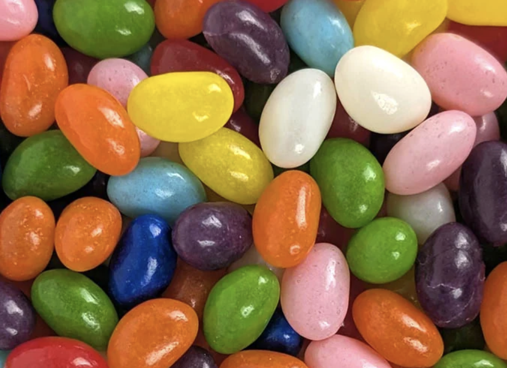 A cupcake with a single swirl of frosting reads as “celebration” in about a tenth of a second, at any size, in any culture that has met a birthday. A jellybean reads as “sweet, small, plural, cheerful” even when it is rendered as a flat oval with one highlight dot. Neither picture contains any information about taste. Both work because the shape has been doing symbolic labour for so long that the food itself has become almost beside the point.
Most foods are terrible symbols. A casserole is a brown rectangle. A salad is visual noise. Soup is a circle. The foods that survive the journey into iconography share a short list of properties, and you can predict which ones will make it by looking at the silhouette alone.
The first property is an outline that stays readable when you shrink it. Test any food by imagining it at the size of a phone notification badge. The cupcake survives because it is two stacked shapes with different textures, a fluted base and a soft dome. The ice cream cone survives for the same reason, a triangle under a scoop. A slice of pizza survives because the wedge is unmistakable. A sandwich does not, because at small sizes it collapses into a beige rectangle with crumbs. The second property is saturated, non-negotiable colour. Jellybeans are the extreme case: they are essentially colour delivered in a neutral shape, which is why they work so well in sets. Put six of them together and you have a palette rather than a pile of food. Watermelon works for the same reason, green rind, white pith, red flesh, black seeds, four zones of hard contrast stacked in a fixed order.
Legibility gets a food noticed. Cultural loading is what makes it mean something.
Cake means the passage of time, because we have spent a century putting candles on it and counting them. Candy means childhood and reward, partly because adults spent a century handing it to children conditionally. Fruit means health and freshness in modern usage, which is a fairly recent inversion of what it meant for most of art history. These associations are not natural facts about the food. They are accumulated habit, and they are strong enough that a designer can invoke an entire emotional register by drawing one small object. That is why food icons do so much work in interfaces that have nothing to do with eating. A gift shop uses a cupcake for its birthday category. A calendar app uses one for anniversaries. A messaging app hands you a slice of cake to say congratulations without words.
Games lean on this harder than almost any other medium, because a game has to communicate value, tier and grouping instantly and repeatedly, often at a glance, often in a small space, often to somebody who has not read a single instruction. The sweets vocabulary is unusually good for that job. It gives you a set of objects that are visually distinct from each other, colour-coded without needing a legend, and already ranked in most players’ heads by richness. A jellybean feels like a small win and a layered cake feels like a big one, and nobody has to be told. That intuitive ranking is why candy themed slots and the wider family of confectionery-styled puzzle games converged on almost the same visual vocabulary independently. The design problem was identical, and the sweet shop happened to be the best-stocked icon set available.
Notice what is not happening in those designs. Nobody is trying to make you hungry. The pieces are rendered glossy and stylised rather than appetising, closer to plastic than to food, because the goal is instant recognition rather than appetite. The moment a rendered sweet starts looking genuinely edible, it starts looking less like a symbol and more like a photograph, and it gets slower to read.
None of this began with pixels. Sugar was a symbolic object in European painting long before it was a cheap one, and museum collections are full of pictures that treat a plate of confectionery as a statement about wealth, morality and time.
The Art Institute of Chicago’s own writing on still life reads them closely, and makes a point worth carrying into any discussion of food imagery: before supermarkets stocked everything year-round, a painting might have been the only place a European viewer would see certain fruit at all. The picture was doing the work the object could not, standing in for abundance that was genuinely out of reach. The essay also notes the names the genre carries in other languages, where the Spanish and Italian terms translate closer to stilled or dead nature than to the neutral English phrase.
Sweets specifically carried a double charge. They signalled status, because sugar was expensive and its presence on a table announced that you could afford it. They also signalled excess and impermanence, which is why confectionery turns up so often in pictures organised around the shortness of pleasure.
The Thyssen-Bornemisza collection’s Louise Moillon still life, painted around 1637, is a compact demonstration of how dense this could get. The commentary on the work identifies a whole grammar operating at once: the fly present as a symbol of corruption, the apricots, plums and asparagus standing for the pleasures of the senses, and the grapes, cherries and strawberries read religiously, with cherries for blood and strawberries, as the first fruits of spring, for resurrection.
Every item there meant more than it appeared to. A seventeenth-century viewer parsed that arrangement roughly the way a modern player parses a grid of coloured sweets: fast, without conscious effort, using a shared vocabulary nobody had to teach them explicitly. The vocabulary changed. The mechanism did not.
So when you next see a jellybean standing in for a reward, or a cupcake standing in for a year passing, it is worth registering that you decoded it without trying. That is the whole trick. The most powerful food symbols are the ones that have stopped feeling like symbols, and simply feel like the obvious picture to use.
P.S. Before you zip off to your next Internet pit stop, check out these 2 game changers below - that could dramatically upscale your life.
1. Check Out My Book On Enjoying A Well-Lived Life: It’s called "Your To Die For Life: How to Maximize Joy and Minimize Regret Before Your Time Runs Out." Think of it as your life’s manual to cranking up the volume on joy, meaning, and connection. Learn more here.
2. Life Review Therapy - What if you could get a clear picture of where you are versus where you want to be, and find out exactly why you’re not there yet? That’s what Life Review Therapy is all about.. If you’re serious about transforming your life, let’s talk. Learn more HERE.
Think about subscribing for free weekly tools here.
No SPAM, ever! Read the Privacy Policy for more information.